This is my final Digipak. I used a mixture of dark tones to try and create an edgy feel. I like the way its tired out. I think that to develop it I could change some of the colours in places, and change some of th enlaces in which the pictures are placed. I think that the tones work well because it isn't too dark but it isn't too bright, or 'pop'-like. I like the extra features, especially the dog tag, and i think it works well because you would normally associate the people who wear that type of thing as quite tough, which is great because people who listen to grunge/post grunge/rock are quite tough and butch so it works well; and for people who are not as tough, there is a lyric and chord book for those who want to have the softer approach on the genre and be more involved with it in general. I like the front cover because its simple but effective. I like how the woods are in the background, and contrast with the black cover. i think this worls with the typical conventions of post grunge; series and glum, but i changed it slightly by adding some swirly mist-like background over it to actually look eerie. The CD is s representation of the band as a whole; messy and powerful. I put their signatures on the CD because i thought this would look cool and would work well because the signatures contrast with the blue and white background making them more prominent and important. Overall, i think that my digipak is good in relation to lack of skill on photoshop and i am quite proud with the finished product because i think that it does reflect the typical post grunge genre well and effectively.
Showing posts with label Digipak. Show all posts
Wednesday, 18 February 2015
Monday, 17 November 2014
Bonus material.
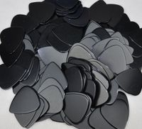
For our bonus material we was thinking along the ideas of a guitar pick, or a few guitar picks with the bands name on it or pictures relating to the album cover on them. we think this would be a good bonus because most people who listen to post grunge music are stereotypically labeled to be able to play the guitar. To make this bonus we would buy guitar picks and paint or engrave the words Tear Down in the bands logo.
This could also be a link to another bonus, maybe also having the lyrics and chords for guitar to play the songs in a book which comes with it. This could have all the lyrics and chords for the songs and would be a great bonus because its different compared to what is normally inside a digipak. For this bonus we would buy a blank square note book and look for the lyrics and chords for the list of sonsgs on album. We would also use the font Jellyka Saint-Andrew's Queen because the floatyness of the writing looks like handwriting which adds an original feel to the book.
Another bonus is that there could be a big poster of the band or the name of the band, which to add to the buns', could be reversible, so that the person who has purchased it can choose what image out of the two they want on their wall. This is a good idea because it will be fitting to consumers needs. For this we would get a good picture of the lead singer or a picture of the band in general, ad add grungy textures over the top and lower the lighting to make edgy photos, then photo shop the bands name onto it and have this as another bonus.
One last bonus, could be a bonus track or a dvd showing the making of the main music video. I think this would be good because it would just add something to the digpak which not many people would have or have thought of. I think it would be simple but have a positive impact on the digipak as a whole. For this we would just Take some of the footage that we couln't use for te actual music video and put it onto a CD. To go along with the themem of the album and ,usic video we coul slow down the footage an dput the same efect over is and play one of the songs over it.
Friday, 24 October 2014
Digipaks
I looked at some digipaks. these are the ones I found the most intersting to analyse as each one had something different to the last. I mainly looked at the colours and what they connote because the colour is a main part in digipaks. I looked at the images and wording too but didnt have as much to talk about.
Subscribe to:
Posts (Atom)